


15. behind: PrettyLittleThing
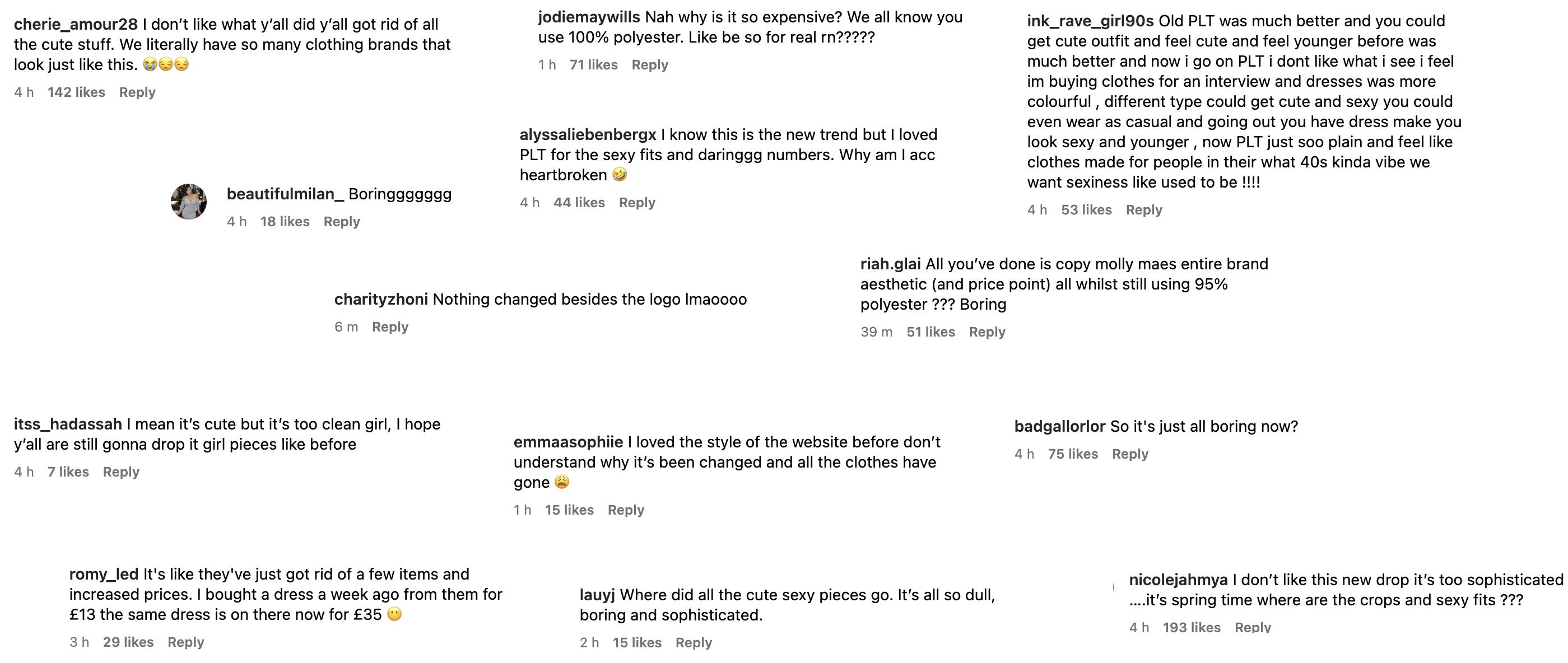
Wake-up PLT just rebranded

Wake-up PLT just rebranded. Ok, maybe you don’t care at all; it’s just another fast-fashion brand. True but I still have opinions (and so does everyone else)!

quickly:
PrettyLittleThing (PLT) is a UK fast-fashion retailer owned by Boohoo Group. The brand rapidly transformed into a multi-million-dollar powerhouse, gaining global recognition through collaborations with influencers like Molly-Mae Hague and celebrities such as Kourtney Kardashian and Naomi Campbell.

After an 18-hour blackout, Boohoo Group-owned PLT revealed its new look—and let’s be honest, it’s... underwhelming. It mimics the same clean girl aesthetic we’ve been seeing for too long.
It’s not necessarily bad, just uninspired. No matter the brand or influencer pushing the clean girl look (though I’ll always make an exception for Bieber), it feels like more of the same.
So here are my thoughts on the rebrand—and the direction I would’ve taken instead…
why the rebrand?
In April 2023, Kamani stepped down as PLT’s CEO, and things started to fall apart. 18 months later, he was back, vowing to "make meaningful improvements."
Translation: PLT needed a reset. Years of bad press—from poor quality to terrible customer service, return fees, and outright banning shoppers—had caught up with them. Their parent company, Boohoo, reported a £6.5 million pre-tax loss in early 2024, down from £22 million in profit the previous year.
This rebrand is classic fast fashion: when you can’t innovate, rebrand.
I think it’s less about “legacy” and evolution, and more about erasing the past—while justifying higher prices. Which is why many have been left disappointed that PLT didn’t use this opportunity to make real, public commitments to better ethics and sustainability. Without transparency, “elevated” just becomes another marketing buzzword.


dissecting the rebrand
PLT’s customers didn’t ask for a rebrand (at least visually), which is why this is all falling flat. I think if you’re going to overhaul the brand for no reason, at least make it feel fresh. Instead, this feels like a copy-paste job from every other ‘elevated’ fast fashion brand out there.
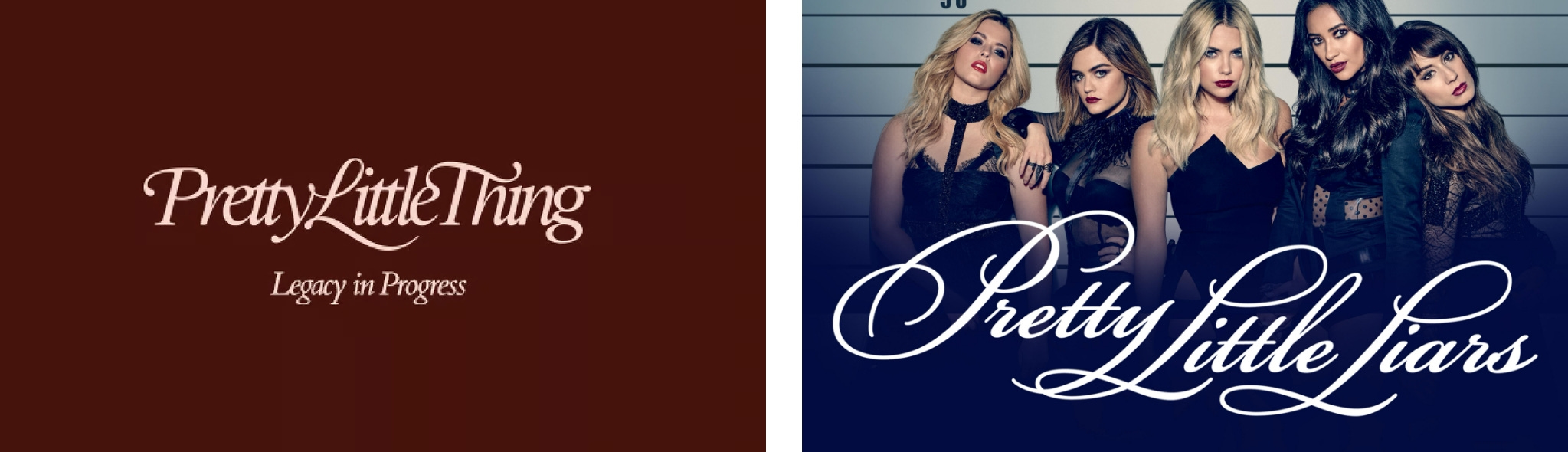
The wordmark is pretty—cursive logos are always nice. But something about it feels too familiar...
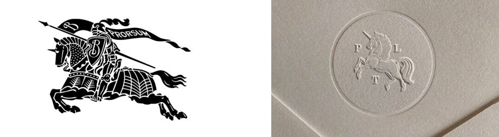
Umar Kamani says the playful unicorn has "matured into a sophisticated heritage-inspired" mark. I like that they kept the unicorn—it's one of PLT’s most recognisable identifiers. But now it reminds me of Burberry or Ralph Lauren.
Bubblegum pink has been replaced with “dusty pink, garnet, and blush sand.” Pretty, but hardly groundbreaking. The new collection campaign screams ‘old money luxury’—which is fine, except PLT has never been a luxury brand…
PLT now claims that “fashion essentials should be available to all.” But isn’t that what fast fashion has always been? What’s new here? They also talk about “claiming authority and credibility.” But let’s be real PLT aren’t credible. They take trends, make them cheaper, and sell them to the masses. Pretending otherwise is disingenuous.
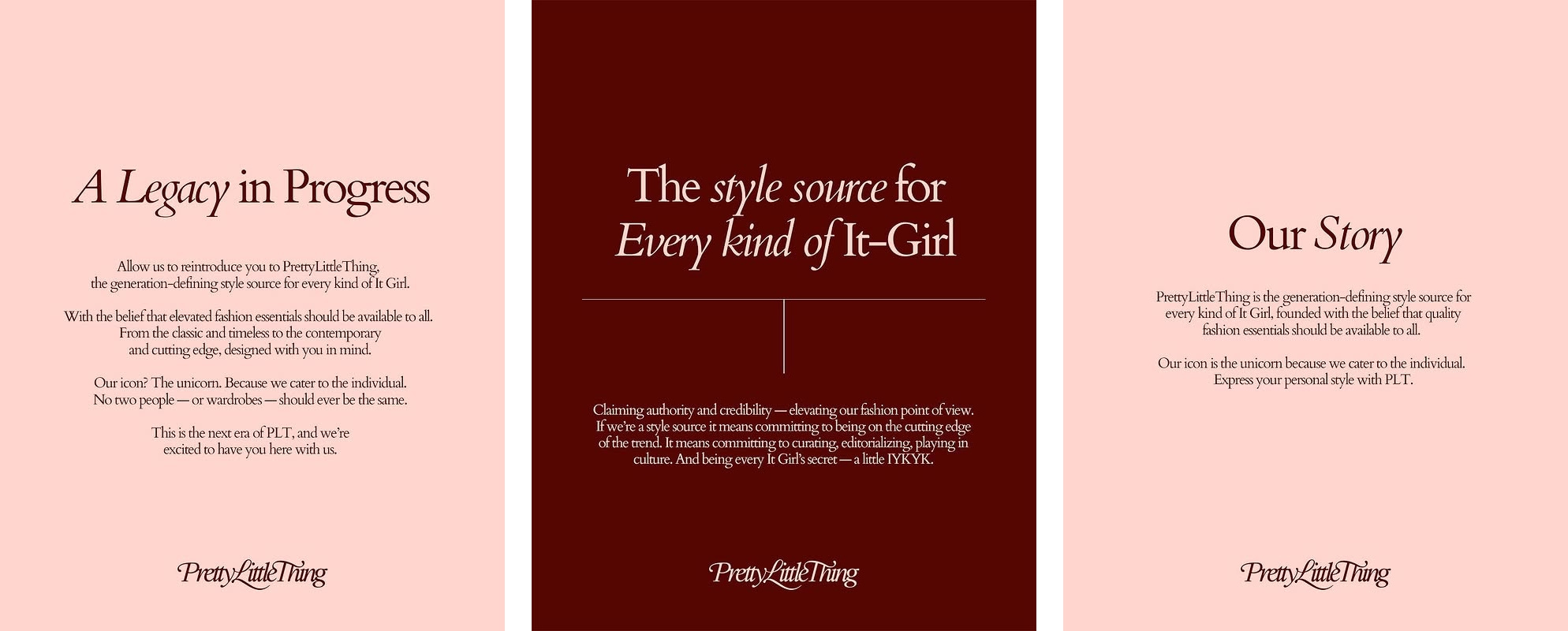
I do like “the style source for every kind of girl.” That tagline makes sense—PLT has always thrived on mass appeal, not exclusivity. But don’t like their attempt at forcing their way into ‘It Girl’ territory.
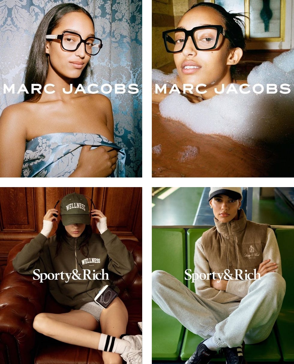
That space belongs to actually cool and ethical brands Reformation, Realisation Par, Sporty & Rich, Susamusa, the list goes on. PLT was never that. It’s fast, trendy, and accessible.

This rebrand isn’t bad, but it is predictable. Higher prices, same quality, new aesthetic. Nothing we haven’t seen before. The Molly-Mae effect1 (a real thing in the UK) sums it up perfectly—this is a direct response to a core chunk of PLT’s audience leaning toward brands like Odd Muse and Meshki. But instead of setting themselves apart, they’re trying to fit in.
my TAKE
PLT built their empire on trend accessibility, influencer slash micro-influencer marketing, and being a go-to for an affordable last-minute night-out fit. Now, they’ve decided they want to have some sort-of heritage—except instead of actually evolving, they’ve just stripped everything fun out of the brand, thrown in some beige, and called it a new legacy.
There are already too many brands doing the clean girl, quiet luxury aesthetic—it’s oversaturated, and it’s boring. The world doesn’t need another lol. What we do need is a brand that fully embraces the girls-girl energy—the chaotic, fun, feral side of fashion. The type of brand that makes you want to text your best friend "what are you wearing tonight?" and plan a whole night around the outfit.
PLT had the chance to be that brand. So here’s what I would’ve done:
the collection — what they should have led with
CEO Kamani says:
We are leaving ‘fast fashion’ as we currently know it behind and discouraging wearing items just once. We want to give our customer styles that she can wear again and again, that can be styled in several different ways. There are no plans to introduce new categories at present, we are more focused on refreshing, refining and improving our current offering to ensure our product range has moved in the same way our customer has grown." (The Industry)
Ok, nice but this doesn't have to mean quiet luxury…
From what I can gather on PLT hauls, TikTok reviews, and customer comments, the core PLT shopper isn’t looking for a quiet, understated capsule wardrobe. They already have Odd Muse or H&M for that. They come to PLT for a LOOK.
And that look usually falls into a few categories—night-out outfits (clubbing, dinner with the girls, date nights, birthdays), holiday hauls, or even more recently, “student style” (athleisure, co-ords, cute tracksuits, etc.).
If I were revamping PLT’s direction, I’d lean into these categories even harder—tapping into "the style source for every kind of girl” messaging in a way that feels intentional, and exciting.
Spring is approaching, and especially here in the UK, the mood is shifting. Girls are happier, getting ready to go out with friends again, counting down the days until they can dress for a little sun. Personally, I would have focused on reinventing night-out fashion and taking a fresh approach to holiday hauls2.
I would have led with cool, statement pieces that cement PLT as the ultimate destination for affordable night-out outfits and holiday wardrobe, in that same way that Rat & Boa has become synonymous with slinky, effortlessly sexy dresses—just more affordable.
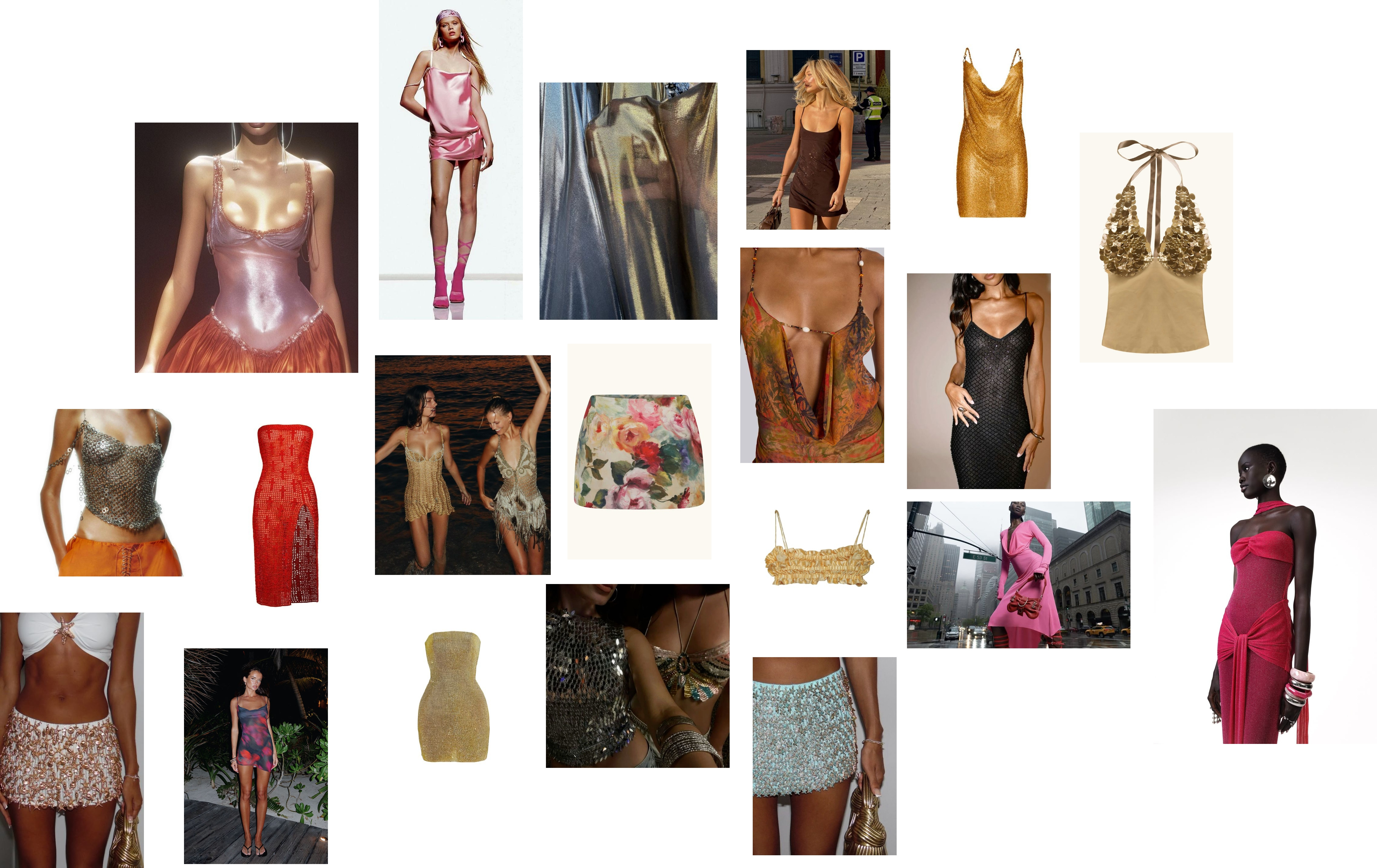
Think chainmail, liquid metallic fabrics, and sequins—I see Paco Rabanne or vintage Versace. Sheer fabrics, fun beading & embellishments, strappy & barely-there details. I’m picturing figure-hugging dresses. Micro-skirts and bralettes reminiscent of early 2000s partywear while still feeling curated and modern. It’s very Blumarine, Nensi Dojaka, Coperni, or even Saint Laurent’s slinkier silhouettes, but executed in a way that feels more relatable, more wearable.
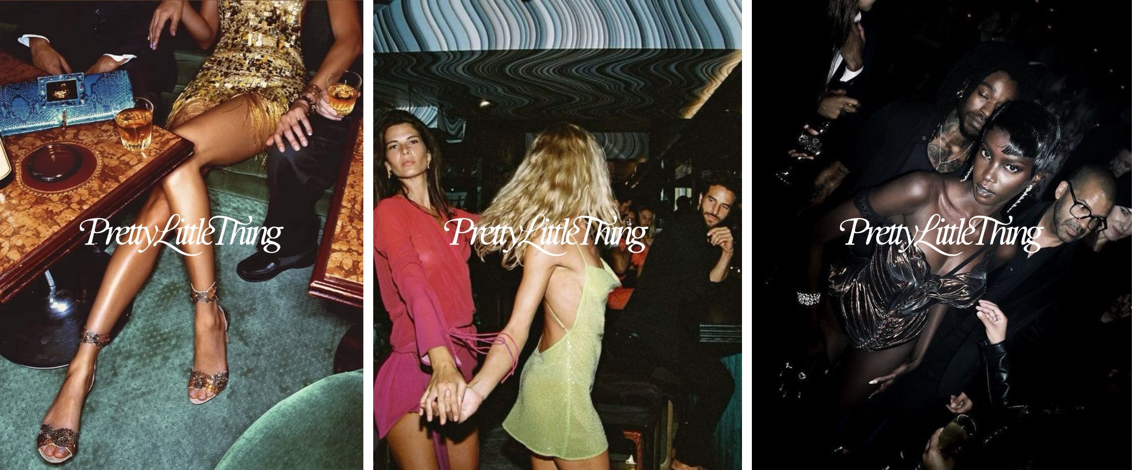
the campaign — that should’ve happened
Now, campaign-wise—this rebrand focused too much on the new logo and refined imagery when it should have been about storytelling. The rollout should have been a story we actually wanted to watch unfold.
Right now, it’s lifeless. Models in muted outfits with zero story. But imagine if PLT had gone the opposite direction—leaning into the ritual of getting ready. The excitement, the messiness, the shared mirror space. The "I have nothing to wear" meltdown. The "this dress is too tight but I’m wearing it anyway" moment we can all relate to.
campaign concept — grwm
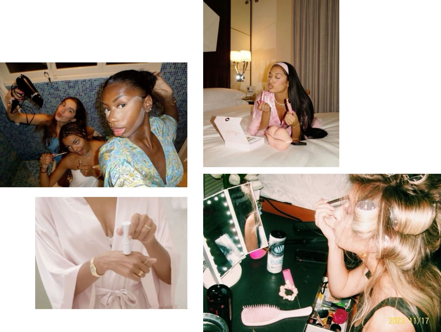
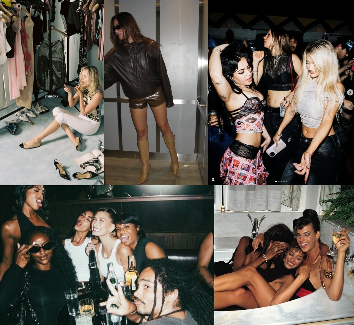
I love the idea of a campaign that feels like a memory. Not just wearing the clothes—but living in them. Instead of stiff, sterile editorial shots, this campaign should feel like an archive of the best nights out—from getting ready with the girls to the main event.
The mood board is nightlife recollections: cinematic, candid, slightly messy3.
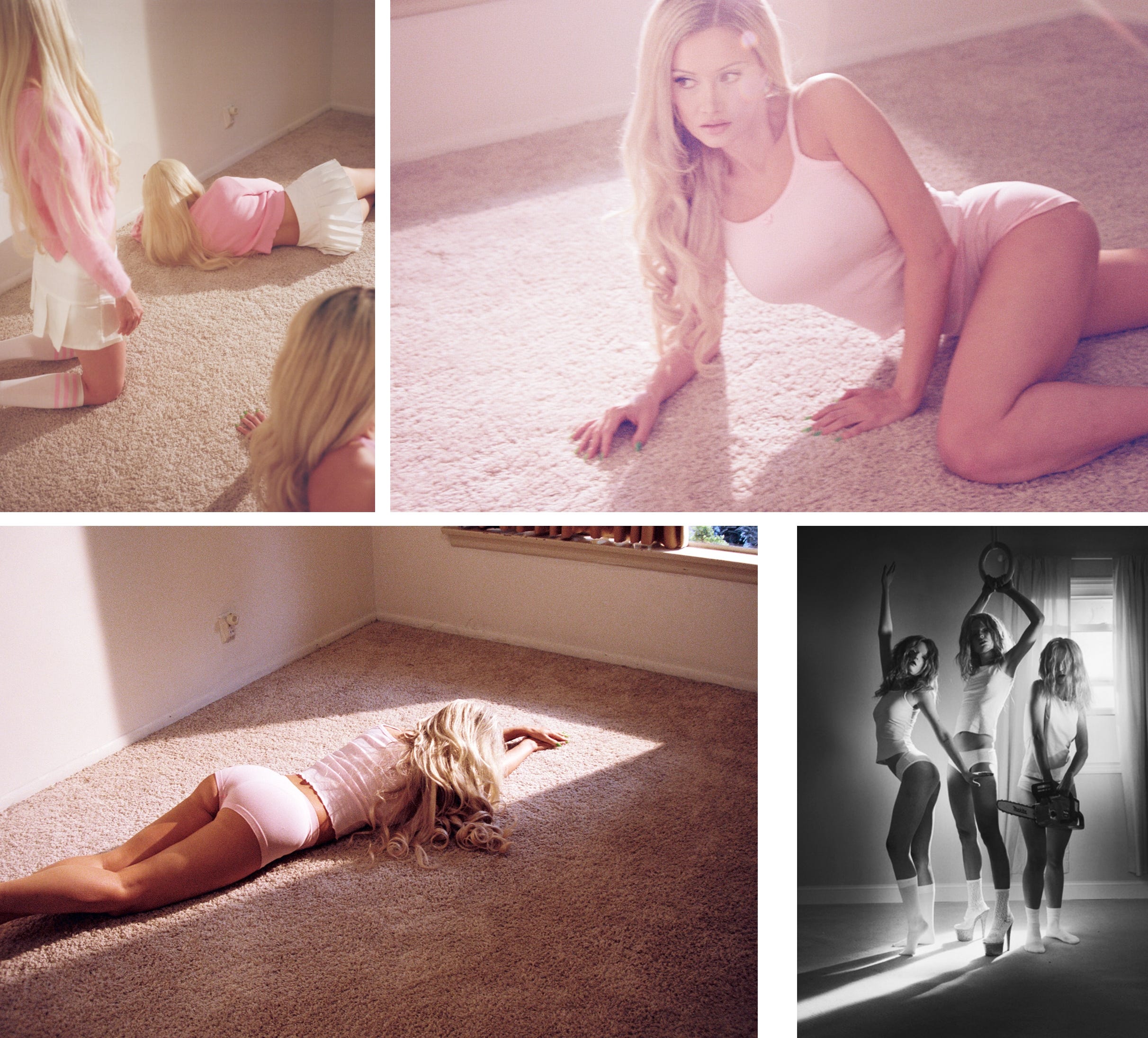
It’s about imperfection in the best way—high grain, a little blur. Shot like a film still—like you just pressed pause on a moment. A little undone but still the hottest in the room.
In my head, I’m referencing the likes of Ewen Spencer for Diesel, Mario Sorrenti (in his 90s era) for that gritty, sexy, effortlessly cool aesthetic. But then I think I’d also want it a little softer and feminine, so it doesn't land too edgy… Am I making sense? See Petra Collins below, for that perfect fusion of dreamy and chaotic.
Within this grwm edit, instead of focusing on one singular aesthetic, PLT positions itself as the go-to for every type of girl—whether she’s the effortless cool girl, the baddie friend, the clean girl, or somewhere in between. This not only makes the brand feel inclusive but also reinforces that the same pieces can be styled in different ways, worn for different personalities.
For execution, I’m keeping the raw, real, high-grain aesthetic but contrasting it with the clean logo placement. Of course, I’m looking at Sporty&Rich for that logo-on-top style they do so well.
What we then get is that balance between lifestyle and product focus; attention to detail but within a high-energy, lived-in environment. This concept transforms PLT into a lifestyle, not just a product—something girls see themselves in, no matter who they are. The goal is for every image to feel like a branded, collectable moment, rather than just a casual snapshot.
Then thinking social4, this campaign can deffo be built for TikTok and Instagram, turning into carousels, reels, and interactive content like that “what type of grwm gal are you?” vibe.
I think of brands like Sisters & Seekers, Topicals, and even Rhode—brands that feel like a friend, not just a store.
I don’t hate the idea of PLT growing up. But if they wanted to elevate, they should have doubled down on what they already did well. They should have built a brand that made girls feel excited to get dressed and go out.
Thoughts??
The "Molly-Mae effect" is a term used to describe the influence of Molly-Mae Hague on her social media followers and on trends and businesses
Now, I’m not a fashion girlie, so I’m just going off vibes here.
Which is actually a rising response to the clean girl look— “Brat” by Charli XCX and “Messy” by Lola Young.)
It’s 2025, a social-first world.
This is such a great post and a real missed opportunity for PLT.
I absolutely love your vision for this- just goes to show what a missed opportunity this is for them! The rebrand feels so stale in comparison to what you suggested.